Free support 24/7
Free support 24/7
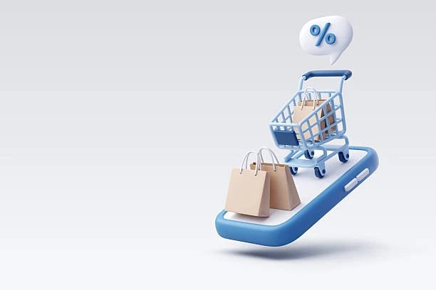
E-commerce stores in Saudi Arabia today rely heavily on clarity and simplicity, but despite this… sometimes a customer needs a “slight nudge” to get their attention on a specific element or understand an important step without being overwhelmed by text or explanations. This is where micro-animations come in – small movements that bring the interface to life and subtly guide the customer's eye.
One store that used the *Sahl* platform implemented a simple animation on the add-to-cart button, just a slight flicker… and the result was a noticeable increase in clicks on the button on the first day!
🔹 1) What are micro-animations?
They are subtle movements within the website… such as:
* A slight vibration of the cart icon
* A gentle flash on a specific button
* A smooth gliding motion when the mouse hovers
* A slight color change for the edges when interacting
These things don't overwhelm the design, but they convey an immediate message: *“This is where you need to pay attention.”*
🔹 2) Why are small movements more powerful than long text?
Humans naturally pay more attention to moving objects than static ones.
Instead of writing, “Click here to complete your order,” the animation itself gives the customer the cue without words.
Especially for customers in a hurry who want to complete their purchase without reading a long message.
🔹 3) Helps the customer make a decision faster
Small movements let the customer know exactly what to do… for example:
– When the product wiggles slightly after being added to the cart
– When the checkout button lights up slightly
These cues save the customer a lot of time and allow them to move to the next step without hesitation.
🔹 4) Enhances the feeling of professionalism in the store
A store that pays attention to these details gives Saudi customers the feeling that the place is “well-organized” and “careful.”
Everyone likes to shop in a store that is visually appealing and has a polished look.
Simple animation helps build this feeling without cluttering the page.
🔹 5) Micro Animations Enhance Engagement with Key Elements
The most important thing on a product page is that the customer sees:
– The Add to Cart button
– Shipping options
– Product features
And these must be clear.
A simple animation on the button or icon draws the eye directly to it, increasing the likelihood of interaction.
🔹 6) When are Micro Animations Annoying?
When they are too numerous, too fast, or overly attention-grabbing.
The Golden Rule:
Animation must serve the purpose… not be aesthetically pleasing.
Animation should be subtle, gentle, and linked to the customer's actions, such as mouse hovering or clicking.
🔹 7) A Saudi Store's Experience Using the Right Animation
One store building its online store through *Sahl* was struggling with customers seeing products but not adding them to their carts.
We implemented a small micro animation for them:
– The Add to Cart button now emits a gentle pulse every 6 seconds.
Within two weeks, the cart addition rate increased significantly, without any changes to the text or prices.
🔹 8) How to Implement Micro Animations Effectively?
- Keep animations very short.
- Avoid strong colors.
- Link the animation to the customer's reaction.
- Use animation only for the most important elements.
- Don't make everything move… so as not to distract them.
The goal is to guide the eye… not to overwhelm it.
Micro Animations are among the most powerful tools to help your customer understand where to go, what to do, and how to complete their order without distraction. When done correctly, they increase conversions and boost visitor satisfaction, especially in Saudi Arabian stores that seek a smooth and simple experience.
If you need help adding the right micro animations to your store—the team is ready to support you anytime.

كيف تخرج صوراً احترافية لمنتجاتك بـ صفر تكاليف

لماذا يكتشف الزبائن التقييمات المضروبة وكيف تبني تقييمات حقيقية
You can create your store easily
