Free support 24/7
Free support 24/7
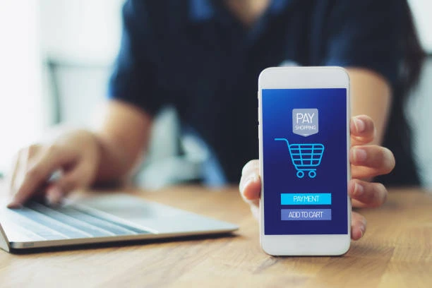
The customer's journey begins on the product page… They look at the images, read the features, feel the product suits them, and then click “Add to Cart.” The story shouldn't end there. The real story continues on the checkout page, because that's where the conversion either happens… or it gets lost.
Many stores in Saudi Arabia focus on making the product page attractive and organized, but when the customer reaches the checkout page, it feels like they've entered a different website! The design changes, the style is different, and they no longer feel the same confidence they had before. This is where hesitation begins.
Let's explain step by step how to make the checkout page a natural extension of the story that began on the product page… to increase the order completion rate in a smart and clear way.
🟦 1. Maintain the same visual identity the customer saw on the product page.
Consistency is the most important element that gives the customer a sense of security.
If the customer saw certain colors on the product page, they should see the same ones at checkout.
– Same color palette
– Same font
– Same card style
– Same button shape
This makes his mind say, “Okay… I’m still in the same place.” If the branding changes, doubt creeps in… and doubt at checkout kills sales.
🟦 2. Keep the checkout page “calm” without distractions
On the product page, we need pictures, details, comparisons… but on the checkout page?
The customer just needs comfort and clarity.
Reduce the elements and make the page:
– Simple
– Direct
– Not overloaded with information
The goal is clear:
Let him focus on completing the order… and that’s it.
🟦 3. Use the purchase summary as part of the story
On the product page, you convince him about the product…
On the checkout page, you need to remind him why he chose it.
Make sure the product summary is:
– Short
– Clear
– Includes a thumbnail image
– Highlights the most important feature the customer previously discovered. This will help them relive the same feeling of conviction they had the first time.
🟦 4. Don't change how prices are displayed.
If the price is in large print on the product page, keep it large.
If the discount is clearly displayed, keep it clear.
If the shipping cost is shown in a short message, use the same format.
A sudden change makes the customer feel like the website is "playing games," and Saudi shoppers are very sensitive to this.
🟦 5. Implement small confidence-building measures to reassure them.
The checkout page should include:
– Secure payment badges
– Encryption icons
– A clear and concise return policy
– Quick contact information.
These elements aren't just for show; they're for building trust.
They reinforce the message you started on the product page: "We are a trusted store."
🟦 6. Use a customer-friendly tone in your instructions.
Instead of saying,
“Enter your shipping information.”
Say,
“Where should we ship your order?”
And instead of saying,
“Confirm payment.”
Say,
“Final step… your order is ready!”
The calm, human approach you used on the product page should carry over to checkout as well.
These things increase harmony and reduce stress.
🟦 7. Make the final checkout button consistent with the “Add to Cart” button.
Same color, same font size, same feel.
This gives the customer the feeling that they are completing the same journey… not jumping to a new, unfamiliar stage.
People like continuity, and the more they feel that the journey is the same… the more conversions they'll make.
🟦 8. Keep the steps simple… keep them concise and clear.
The checkout page should be:
– One or two steps at most
– Without too many fields
– Without asking for unnecessary information
The shorter the process… the greater the chance they'll complete the purchase.
And most importantly: maintain the pleasant style you started with on the product page.
The checkout page isn't a separate page… it's the final chapter of the purchase story.
And Saudi customers, in particular, appreciate a clear page that continues the same style they saw from the beginning.
If you make the checkout page a natural and comfortable extension of the product page, you'll get:
– A higher conversion rate
– Less frequent visits
– A significant increase in completed orders. This way, you'll truly build a smooth and seamless shopping journey… winning over the customer from the first glance to the last step.
كيف تخرج صوراً احترافية لمنتجاتك بـ صفر تكاليف
لماذا يكتشف الزبائن التقييمات المضروبة وكيف تبني تقييمات حقيقية
You can create your store easily
