Free support 24/7
Free support 24/7
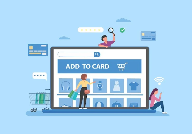
In many online stores, customers reach the cart page and add all the products they like, only to suddenly leave the site without completing the order. What's the reason? Often, poor design or excessive complexity on the cart page is the primary culprit. This page is considered the final stage before payment, and any simple error can make the customer hesitate, or even cancel the purchase altogether.
1. What is meant by cart page design?
When we say "design," we don't just mean the shape and colors. We mean the entire customer experience on the page: from the ease of adjusting the quantity, deleting a product, to knowing the shipping and tax costs, and even moving to the checkout page. Smart design is what makes things easier and quickly leads the customer to their goal without confusion or inconvenience.
2. Mistakes that cause customers to abandon the cart
• Incomplete or unclear information: such as whether the price is inclusive or not, or the delivery cost.
• Complicated steps: When the customer has to scroll through five pages to complete the payment!
• A cluttered or non-mobile-responsive design.
• The sudden appearance of additional costs that weren't initially apparent.
• Lack of convenient payment or delivery options.
All of these mistakes frustrate customers, leading them to lose trust and close the site.
3. Smart Cart Page: How to Create It?
• Clear pricing and expenses: Be transparent from the start; customers don't like surprises.
• Ease of editing and deleting: One button is enough to adjust the quantity or delete a product.
• Smart recommendations: You can suggest a complementary product or a discount if the cart value increases.
• Clear payment options: Let them quickly choose the most suitable method, especially if they offer cash on delivery or Mada.
• Mobile-responsive design: Because more than 70% of visitors in Saudi Arabia browse from their mobile phones.
4. Experience a Successful Saudi Store
An online store in the Kingdom was suffering from a high cart drop rate. After redesigning the page, focusing on reducing the number of steps and making everything clear from the beginning, their order completion rate increased by 27% in just two months! The experiment proved that even a simple change can make a huge difference in sales. 5. Create a psychological connection between the customer and the cart
Don't forget that when a customer places products in their cart, they're actually interested. They're ready to buy. If you leave them with an annoying or slow experience, you're missing out on a near-guaranteed opportunity. Improving your cart design is one of the easiest and fastest ways to increase conversion rates without additional marketing costs.
6. Do you need a designer? Or a partner who understands user experience?
If you own an online store in Saudi Arabia and want to improve your cart page design, don't rely solely on ready-made templates. Try to work with a company that understands how to build a comprehensive user experience, not just a pretty face. A "Sahl" team is ready to help you build a store that takes the customer to the final step without hesitation.
You may think the cart page is just a simple detail, but it's actually the final link in the purchasing chain. If it's neglected, you're losing customers who are ready to buy. If it's intelligently designed, you'll notice a huge difference in profits. Review it, develop it, and don't underestimate its power!

كيف أصبحت بوابات الدفع شريكاً في الربح وليس مجرد وسيط

كيف تعرف ماذا سيطلبه العميل قبل أن يعرف هو نفسه
You can create your store easily
