Free support 24/7
Free support 24/7
When a customer opens your online store, they only have a few seconds before deciding:
Should they continue browsing? Or exit?
This is where smart design comes in. It "speaks confidence" and reflects your professionalism, even if the customer doesn't say a word.
In this blog, we'll reveal the most important design secrets that will make your store send a clear message: "You're in the right place, and buying here is guaranteed."
1. Colors: Don't Let Them Be Random
Colors have a powerful psychological impact. Your store should express the type of your products and represent your identity.
• Blue: Indicates confidence and professionalism (often used by banks).
• Green: Instills reassurance, ideal for natural or food products.
• Red: Grabs attention, excellent for offers and alerts.
• Black and gray: Reflect luxury and sophistication, suitable for high-end products.
Tip: Stick to 2-3 colors, and don't use too many, to avoid distracting or confusing the design. 2. Fonts: Don't Be Temperamental
Some stores use many different fonts, and the result? Visitors get confused and feel disorganized.
• Choose a clear, easy-to-read Arabic font, such as "GE SS Unique" or "Cairo."
• Maintain a consistent font across all pages, and maintain an appropriate size for headings and text.
Principle: If a visitor gets tired reading, they'll leave immediately. Comfortable font = successful user experience.
3. Images: Quality Matters Over Quantity
The image is the first thing a customer sees, and it's what sells them before they read a single word.
• Use clear, high-quality images, preferably your own if possible.
• Don't include images from the internet that contain watermarks or are of poor quality.
• Images should be consistent in size and style to avoid making the store look haphazard.
If you don't have professional photos? Invest in a one-time photoshoot and let it make a difference in the first impression.
4. Header and Footer: The Store's Face and Footer
The header (top of the page) should contain:
• The logo
• The organized navigation menu
• The cart and account icon
The footer (bottom of the page) is ideal for:
• Contact links
• Payment methods
• Delivery information and return policy
Imagine the store as if you were inside a store: Header = storefront, Footer = cashier and information.
5. Balance Space: Don't Crowd Customers
In store design, white space is important. It makes the site look organized and easy to navigate.
• Don't cram products and words onto each other.
• Use clear divisions between sections.
Orderly and simplicity encourages customers to continue browsing, rather than feeling overwhelmed and leaving.
6. Clarity of Visual Identity: Be Distinctive
Is your logo clear? Does the store have a unique character? Don't you feel like you've seen its design on a thousand other websites?
• The visual identity should express your name and personality.
• Try to make the colors, font, images, and logo speak the same language.
Customers will remember you more if they feel your store has a clear personality.
Trust doesn't come from words alone... Your store's design speaks for you.
When customers first enter, they should feel they're entering a respectable, organized, and painstakingly crafted space that reflects a safe and easy shopping experience.
If you don't know where to start, or want to create a professional design that suits the Saudi market, our Sahal team is ready to help you step by step...from choosing colors to arranging the store in a way that ensures the customer leaves with a purchase.
كيف تحول كرتونة الشحن إلى أداة تسويقية تجعل العميل يصورها وينشرها مجاناً

كيف تبني نظاماً بيئياً (Ecosystem) يسيطر على قطاعك بالكامل؟
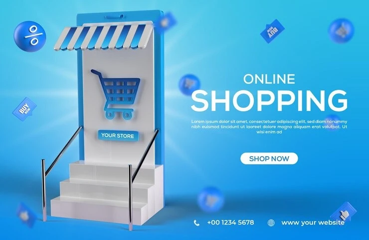
You can create your store easily
