Free support 24/7
Free support 24/7
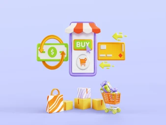
In the world of e-commerce, a small button that says "Add to Cart," "Order Now," or "Discover More" can mean the difference between a customer clicking the purchase button and a customer leaving the store without returning.
Call-to-action (CTA) buttons are an essential component of every successful store, but using them correctly is what makes the difference.
In today's Saudi market, with increasing competition, smart stores know how to guide customers step-by-step through the process of ordering. This small button, if designed correctly and placed in the right place, can double your sales and make your store look more professional.
Let's break it down further:
1. What does a CTA mean and why is it important?
A CTA is any button or link that prompts a customer to take a specific step: "Shop Now," "Get the Offer," "Get Started for Free." Its presence is like a salesperson standing next to the customer, guiding them through each step.
Without it, the customer could get lost, hesitate, or leave the store without completing any transaction.
2. CTA buttons increase orders... if they're clear.
If a customer doesn't know what the next step is, it's natural for them to hesitate. But when you provide a clear and direct button like:
"Order now - free delivery"
or
"Add to cart - limited stock"
you're essentially saying: You see the opportunity right in front of you, don't miss it!
3. Where should you place the CTA in your store?
The strategic placement of the button is very important. It should appear on:
• The product page (and you can repeat it more than once).
• The header or home page.
• The end of each description or special offer.
• Within ads or pop-ups.
The goal: The longer the customer stays, the more they'll find a call to action.
4. Button design plays a major role.
It's not enough to simply write "Buy Now." The button must:
• Be prominent in a distinct color that grabs attention.
• Be appropriately sized, neither too large and annoying nor too small and unnoticeable.
• Be written in simple, clear language.
• It creates a sense of immediate "opportunity" or "benefit."
A successful example?
"Book your discount now - for a limited time"
"Start your free trial today"
5. Real-life examples from the Saudi market
Some Saudi stores use CTAs very professionally. For example, a store selling natural products wrote:
"Discover the secret to natural beauty - Order now"
Or an electronics store wrote:
"Get free shipping now - limited stock"
These buttons encouraged visitors to place an order immediately without much thought.
6. CTAs aren't just for purchasing - you can use them for all stages of the journey.
CTAs serve more than one purpose:
• Sign up for the newsletter
• Download a catalog
• View a special offer
• Start a WhatsApp chat
• Subscribe to the store's app
Each CTA brings the customer closer to the final purchase.
7. CTAs with timing = stronger impact
If you use a CTA with a sense of urgency (such as: "Offer ends in 2 hours"), the customer feels they need to act quickly...and this significantly increases order volume.
A CTA isn't just a button... it's a key that unlocks orders. The smarter you design it, explain it in compelling language, and place it in the right place, the more likely a customer will take action and complete the order.
If your online store doesn't have clear CTA buttons, you're missing out on significant opportunities and leaving customers hesitant instead of buying.
Start by reviewing your store pages and adding CTAs in every important place... and watch as orders begin to increase day by day.

كيف تستخدم (المؤثرين الصغار) لبناء جيش تسويقي لمتجرك بتكلفة أقل من إعلانات فيسبوك
كيف تحول منتجك لتدفق نقدي شهري يضمن لك مبيعات حتى وأنت نائم
You can create your store easily
