Free support 24/7
Free support 24/7
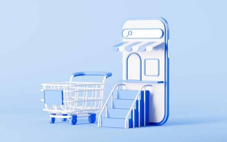
Many e-commerce store owners focus on adding new products or improving prices, but they forget the most important thing: Is the store itself clear and easy to use?
If your customer can't access the product, or doesn't know how to complete the purchase, you've lost them from the first step.
In the Kingdom of Saudi Arabia, with the proliferation of e-commerce stores, customers have easily switched to the store that offers them a clearer and faster experience. The question here is: Is your store clear? Or do customers get lost and distracted?
1. What do we mean by store clarity?
Clarity means that the customer opens your store and quickly knows:
• What you sell
• Where the products are
• How to add to the cart
• How to pay and complete the order
If they get lost among the pages, or are confused about finding a specific product, that's where the problem lies.
2. The most important elements of clarity within the store
• A clear main menu: Includes only the important categories without clutter.
• An effective internal search engine: The customer can type in the product name and access it directly.
• A visible and clear cart button: They don't need to search for it or scroll down.
• A well-organized product page: title, description, price, images, buy button... all clear and don't require a lot of scrolling.
3. Signs Your Store Needs Organizing
• Many visitors browse quickly without browsing.
• Customers always ask, "Where can I find this product?"
• There are many clicks but no orders.
• You find customers getting stuck at the checkout step or hesitating.
All of these are signs that your store is confusing or complex and needs to be addressed.
4. What can you do to make your store clear?
• Test your store as if you were a new customer: Did you understand quickly? Is navigating between pages easy?
• Reduce visual clutter: Don't use too many colors or loads of text everywhere.
• Focus on your CTAs (calls to action): Make them prominent and clear, such as "Add to Cart" or "Pay Now."
• Test your store with unfamiliar people: Get their feedback if they feel confused or can't complete the steps.
5. Examples of Successful Stores with Clarity
Many large Saudi stores, such as Noon or Amazon Saudi Arabia, have very high clarity.
From the moment you enter:
• You know what they sell
• What the offers are
• How to add the product
• How to complete the checkout
There's no fuss, and that's the reason for their success.
6. Does design play a role?
Of course!
Store design (UX/UI) isn't just about looks. It's about making the customer feel like they can access anything in seconds.
Think of it like organizing a real store. Are you putting everything in its proper place? Exactly the same idea.
7. If you're using a ready-made platform, pay attention to these points:
• Make sure the template you use supports a smooth user experience.
• Don't load the store with unnecessary add-ons.
• Test each page on mobile, tablet, and desktop.
Clarity isn't secondary; it's the foundation of any online store's success.
Customers in Saudi Arabia today have become smart, and if they get lost in your store, they'll easily find what they're looking for elsewhere. Review your store, test the customer experience, and contact the Sahl team if you'd like help designing a clear, organized online store that increases sales from the first visit.

تبسيط إدارة المتجر الإلكتروني يساعدك تتابع الطلبات المنتجات والعملاء بدون ضغط أو تعقيد حتى لو كنت بتدير المتجر لوحدك

التفاصيل الفنية الواضحة داخل المتجر الإلكتروني تقلل أسئلة العملاء وتساعدهم ياخدوا قرار الشراء بثقة ومن غير تردد
You can create your store easily
