Free support 24/7
Free support 24/7
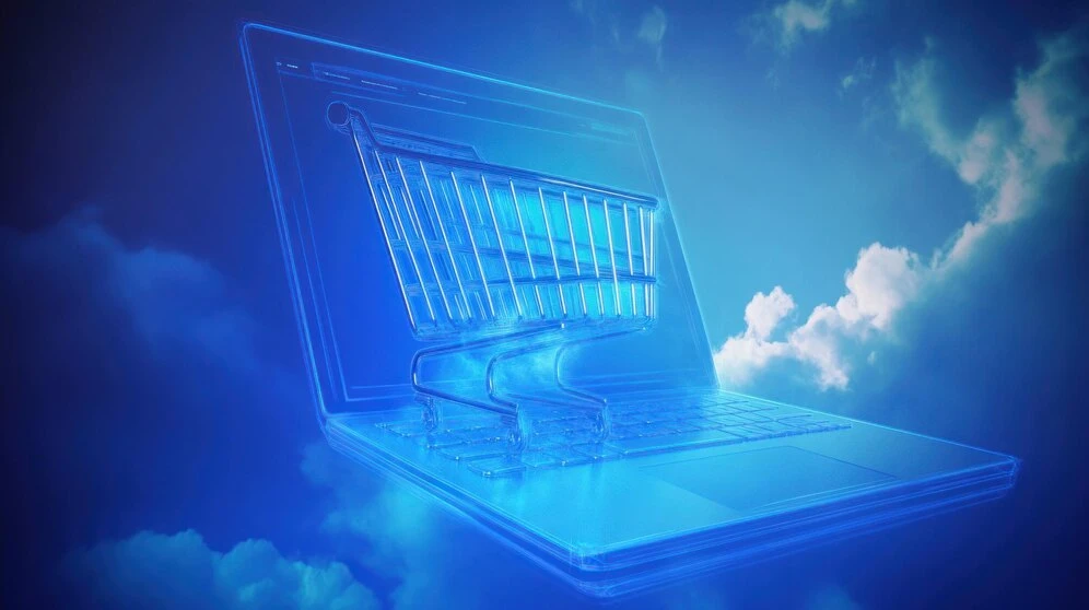
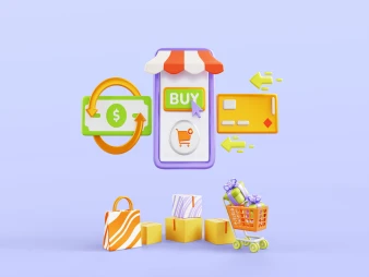
In every online store, there's a simple element with a huge impact: the "Add to Cart" button. Many store owners see it as a minor detail, but the truth is that its location and appearance can make a huge difference in a customer's decision, determining whether they complete the order or leave the site and go to someone else.
1. This button is more important than you might think
Studies show that many visitors decide in seconds whether to continue with the store or not, and the location of the "Add to Cart" button plays a major role in this decision. If it's clearly visible, accessible, and nearby, it makes the shopping experience smooth and comfortable. But if it's hidden, far away, or requires the customer to search for it, it could simply pop up and cost you a sale.
2. The button's location should be "above the fold"
In design, there's a term called "above the fold," meaning the part of the page that's visible to the visitor when they first open the page without clicking or scrolling down. The "Add to Cart" button should be clearly visible in this location, especially on mobile, as most visitors today are using their phones. If you leave it below or linked to something that only appears when scrolling, the likelihood of losing a customer increases.
3. Saudi customers love speed.
In the Saudi market, many customers love speed and simplicity. They don't want to struggle to find a button or complete the next step. Store design should be based on this behavior: everything is clear and easy, and they can add the product to the cart in one step.
4. Color and shape play an important role.
Placement isn't everything; even the shape of the button itself makes a difference. Bright, clear colors like green or orange create a sense of excitement and movement. Don't forget that the button should be an appropriate size and have an eye-catching design without being obtrusive.
5. Try more than one design.
The best way to know what works best for your store? Experiment. A/B test two versions of the product page, one with the button in a specific location, and the other in a different location, and compare the results. You may find that a simple change in the button's location increases your sales by 10% or more.
6. The overall experience matters.
Button location is important, but it's not the whole story. The entire page must be optimized to persuade the customer: attractive images, clear descriptions, authentic reviews, and excellent loading speed. A button doesn't work on its own; it's part of an integrated experience that inspires trust and purchase.
كيف تستخدم (المؤثرين الصغار) لبناء جيش تسويقي لمتجرك بتكلفة أقل من إعلانات فيسبوك
كيف تحول منتجك لتدفق نقدي شهري يضمن لك مبيعات حتى وأنت نائم
You can create your store easily
