Free support 24/7
Free support 24/7

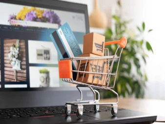
In the world of e-commerce, today's Saudi customer enters a store expecting everything to be clear, organized, and readily available without any confusion. One of the biggest sources of confusion for visitors—especially on their first visit—is the number of main categories. Too many can be overwhelming, while too few can make them feel like they're missing something. That's why balance is key; it makes a huge difference to the customer experience and directly impacts their purchasing decision.
1. Define Your Store Identity Before Defining Categories 🧭
The first step to avoid getting lost is defining your identity: What do you sell? What are your main categories? Are you a general store or a specialized one? For example, in Saudi Arabia, stores specializing in personal care, electronics, or perfumes often need 4 to 6 main categories because they are clear and specific. General stores, on the other hand, need a more in-depth approach to avoid overwhelming the page with too many categories. Once you know your identity, you'll know how many categories you actually need.
2. Divide Categories into Levels Without Overloading the Homepage 🗂️
Not every category needs to appear on the main menu. It's best to focus on the essential departments that represent 70% of your store's activity, with the rest categorized under sub-menus. This approach is common in major Saudi stores because it reduces crowding and helps customers find their way quickly.
3. Balancing Smoothness and Depth ⚖️
Some stores try to drastically reduce the number of departments, but customers need a clear and logical transition from one department to the next. The balance lies in each main department having logical sub-headings without creating a chaotic, cluttered atmosphere. For example, the "Fashion" department could have sections for men, women, and children, each with its own subcategories. This allows customers to navigate the store comfortably.
4. Testing the Number of Departments on Mobile Before Computer 📱
A common mistake is basing departments on a computer-based layout. Since most visitors to Saudi Arabia shop primarily on their mobile devices, too many departments can result in a long and cumbersome mobile sidebar or drop-down menu. The correct solution is to build departments using a mobile-first approach. This means starting with the mobile design, testing how the sections appear, and then expanding to the desktop version.
5. Analyze customer behavior before modifying any section 👁️
Not everything is measured by expectations. On platforms like Sahl, you can see which sections people visit most, which categories don't get much traffic, and which pages your customers get lost in. Based on this data, you can start reducing or increasing sections, and merging some if they're unnecessary. The customer gives you the answer without saying a word.
6. Use section names that Saudi customers easily understand 📝
Some stores use complex or foreign terms, which confuses customers. It's best to use clear and direct names, especially in the Saudi market, which prefers simplicity: “Home Appliances,” “Electronics,” “Perfumes,” “Baby Supplies.” The clearer the section names, the less confusion there will be.
7. Maintain the logical order that customers follow in their daily lives 🔍
A consistent section arrangement is important. If you change their locations frequently, customers have to search again, which disrupts their experience. Keep the arrangement logical and consistent, following the product logic. For example, in fashion stores, the order is always "Men," then "Women," then "Kids." Saudi customers are accustomed to this arrangement.
8. Simple A/B Testing Before Implementing Any Major Changes 🧪
Before implementing any major changes, try two versions of the arrangement and number of sections. Try a set with one version containing only 5 sections and another with 7. See which version receives more clicks? Which one gets the customer closer to the product faster? These tests give you a real, data-driven decision.
9. Reduce Menu Clutter Using Simple Icons 🎨
Having a simple icon to the right or left of a section (such as perfume, phone, dress, etc.) helps the customer's eye identify the section more quickly. It's important that the icon is simple and uncluttered to create organization, not clutter. Customers prefer a clean look, especially on their phones.
The balance in the number of sections isn't just about visual arrangement; it's about understanding how Saudi customers think and navigate within the store. If you organize the sections correctly, you'll increase customer retention time, boost product discovery rates, and ultimately boost sales without making any major design changes. This is precisely what distinguishes professional stores from ordinary ones.

بعض المتاجر ما تحتاج تصميم جديد بس تحتاج ترتيب مختلف يحسن تجربة العميل
نكشف لك الاستراتيجيات المالية واللوجستية التي تضمن لك تحقيق أرباح حقيقية وكيف تحسب هوامش ربحك بذكاء
You can create your store easily
