Free support 24/7
Free support 24/7
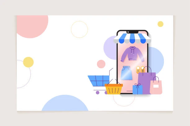
In the world of e-commerce, especially in Saudi Arabia, many store owners focus on images, specifications, and prices, but overlook a much more important point: product page layout. Placing the wrong element in the wrong place can easily ruin your sales. A customer enters a product page in seconds, so if they don't see the essential information clearly and quickly, they're likely to leave the store without completing their order. This is where the real secret lies: What element can save you? What should the customer see first? And how do you arrange your page correctly?
1. Why is the arrangement of elements on the product page so important?
Today's customer is in a hurry and doesn't have time to search or figure out where the essential information is. If they enter your page and don't see the right image, price, offer, or purchase button in a prominent place, it's a direct loss without you even realizing it. Page layout is the "silent language" that guides the customer toward buying... or drives them away.
2. The element that can ruin sales if placed incorrectly
The most problematic element is price.
If the price is hidden, small, faded, or far from the product title, the customer feels confused or distrustful. The price must be clear, large, and very close to the product title. The same applies to discounts; they must be prominent and obvious because many customers in Saudi Arabia focus on the price above all else.
3. A story from a Saudi store: How a simple layout boosted sales?
A store in Dammam was experiencing high traffic but no sales. When we reviewed the product page, we found that the discount was displayed at the bottom of the last line of the specifications! This meant customers wouldn't discover the offer until it was significantly reduced. As soon as we moved the discount to the top, next to the price, in a clear font, sales increased by 38% in less than two weeks.
The problem wasn't with the product or the price; it was simply with the page layout.
4. What element should the customer see first upon entering?
The essential elements vary depending on the type of store, but generally include:
* A clear main image
* A concise product title
* Price + Discount (if applicable)
* A Buy or Add to Cart button
These four elements should be at the top (above the fold) so the customer doesn't have to scroll down.
5. Elements that cause distraction if placed at the top
Some stores unintentionally clutter the page, such as:
* Adding too many reviews at the top
* Writing a long description before the price
* Displaying similar products before the product information
* Including banners or advertisements within the product page
All of these confuse the customer and disrupt their focus, leaving them unsure of what to do first.
6. How to organize your product page perfectly?
Here are some quick and simple steps:
* Place the large image first
* Directly below it, a clear and concise title
* Next, the price and discount in a clear font
* Then, an attractive Buy button
* And below all of this, a detailed description and specifications
This method allows the customer to navigate step-by-step in a logical and clear manner.
7. Why does page layout differ from store to store?
A store selling luxury products needs to focus on large images.
A store selling competitively priced products needs to highlight the price first.
A store selling tech products needs a clear title that quickly explains the benefits.
There's no single page template that applies to everyone… it needs to be built according to the target audience and their decision-making process.
8. How does “Sahl” help you with product page layout?
At Sahl, we design and arrange product pages in a way that guides the customer through a clear journey from the very first second. Our team identifies errors, organizes elements according to the product and target audience, and fine-tunes the user experience to increase sales without changing the store's core content.
Our goal is for the customer to see the most important information first… and proceed to purchase without hesitation.
Product page layout isn't just about aesthetics… it's a critical decision for your sales. One element in the wrong place can ruin a purchase, while well-organized elements can significantly boost your profits. If you want to succeed in the highly competitive Saudi market, organize your page intelligently and make sure that the customer sees the most important information from the very first second.

بعض المتاجر ما تحتاج تصميم جديد بس تحتاج ترتيب مختلف يحسن تجربة العميل
نكشف لك الاستراتيجيات المالية واللوجستية التي تضمن لك تحقيق أرباح حقيقية وكيف تحسب هوامش ربحك بذكاء
You can create your store easily
