Free support 24/7
Free support 24/7

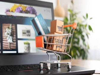
You might not expect it, but many online stores in Saudi Arabia lose significant amounts of money every month due to a very simple mistake: an unclear "buy now" button. Imagine a customer who sees an ad, clicks on the product, likes the price and specifications, but can't easily find the "buy now" button… Naturally, they'll leave the site immediately and look for another store. In the world of e-commerce, small details make all the difference, and the "buy now" button is one of the most important details that can significantly boost or degrade your sales.
2. Why is the clarity of the "buy now" button so important?
Today's customer is in a hurry and wants to browse quickly, especially in the highly competitive Saudi market. Any step that isn't clear can cause them to lose interest in just two seconds. The "buy now" button is the "final step" to completing an order, and if it's hidden within the content, its color is unclear, or it's too small… that's a direct loss that doesn't require much analysis.
3. A short story that happens every day
One customer in Riyadh was complaining that his store had high traffic but no sales. After a quick review of his store's design, we noticed that the "Buy" button was a light gray color and positioned below the images in a way that didn't catch the eye. This meant customers had to scroll down a bit and search, which often didn't happen! As soon as we made it a more prominent color and larger, orders increased by 34% within two weeks. This simple example illustrates that the problem isn't the price or the products themselves… many problems lie in the small details.
4. Button Colors… It's Not Just a Matter of Personal Taste!
Many people choose the color of the "Buy" button based on their personal taste, and this is a huge mistake. Colors need to be clearly visible within the design. For example:
* If the store's color scheme is blue… choose a yellow or orange "Buy" button.
* If the background is white… choose a bold color like green or red.
It's more about science and psychology than just aesthetics, and a small difference in color can completely change customer behavior.
5. Button Size and Position… More Important Than You Think
The "Buy" button needs to be prominently displayed at the top (above the fold) because most visitors don't scroll down. The size also needs to be mobile-friendly because over 75% of online store visitors in Saudi Arabia browse using their phones. Imagine losing all that audience because of a tiny button?
6. The button text… It needs to be clear and direct.
Some stores use strange text like “Add to cart to get your offer now.” Visitors don't want long sentences… they want a direct word they understand immediately:
Buy now – Add to cart – Complete order.
All clear words help them make a decision without overthinking.
7. How can you be sure your store doesn't have this problem?
Do a simple test: Take someone else's device, go to your store, and see:
* Can you see the purchase button immediately?
* Is its color clear?
* Is its size appropriate?
* Is the text direct and understandable?
If it takes you 3 seconds or more to find the button… then you have a problem that needs fixing.
8. How does “Sahl” help you correct the mistake?
At Sahl Company, we focus on the details that many store owners overlook, as they can lead to significant losses without the owner realizing it. Our team reviews page design, adjusts the purchase button, and optimizes the customer experience to ensure visitors navigate through clear and easy steps until they complete their order. The goal is to increase conversion rates and boost sales without any additional costs for you.
The purchase button may be the smallest element on the page, but it has the most significant impact on your profits. As they say, "It's not the big deal that confuses you; it's the small details that make all the difference."
Ensure your store design is clear and simple, allowing customers to easily find their way to purchase without having to search. With a few simple improvements, you'll see a significant difference in orders, especially in the highly competitive Saudi market.

بعض المتاجر ما تحتاج تصميم جديد بس تحتاج ترتيب مختلف يحسن تجربة العميل
نكشف لك الاستراتيجيات المالية واللوجستية التي تضمن لك تحقيق أرباح حقيقية وكيف تحسب هوامش ربحك بذكاء
You can create your store easily
